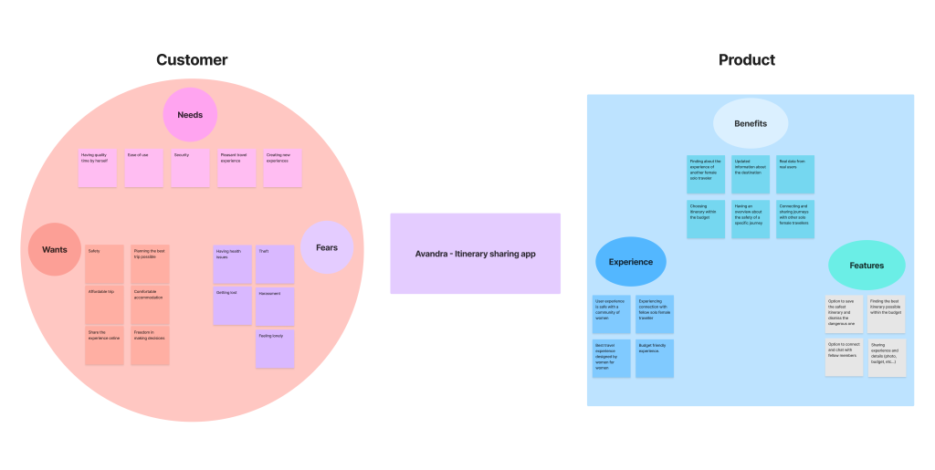
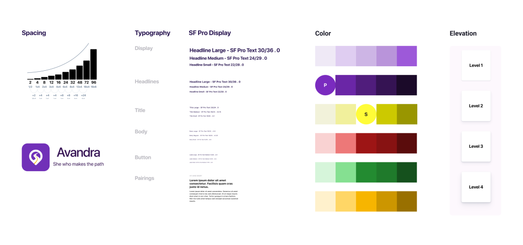
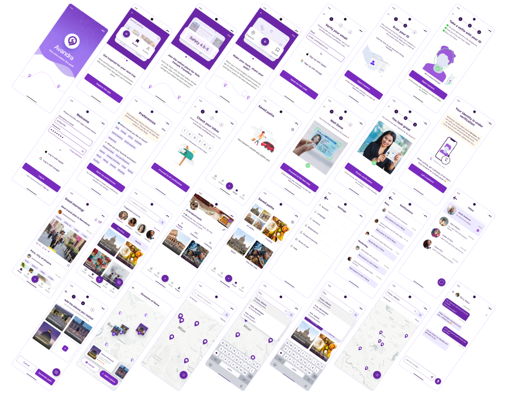
Avandra
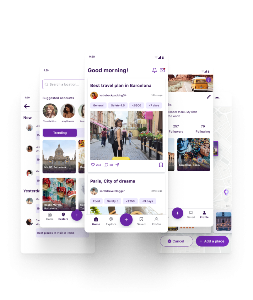
Social media app for female solo travelers
UX design ▪ Hackathon ▪ IterateUX
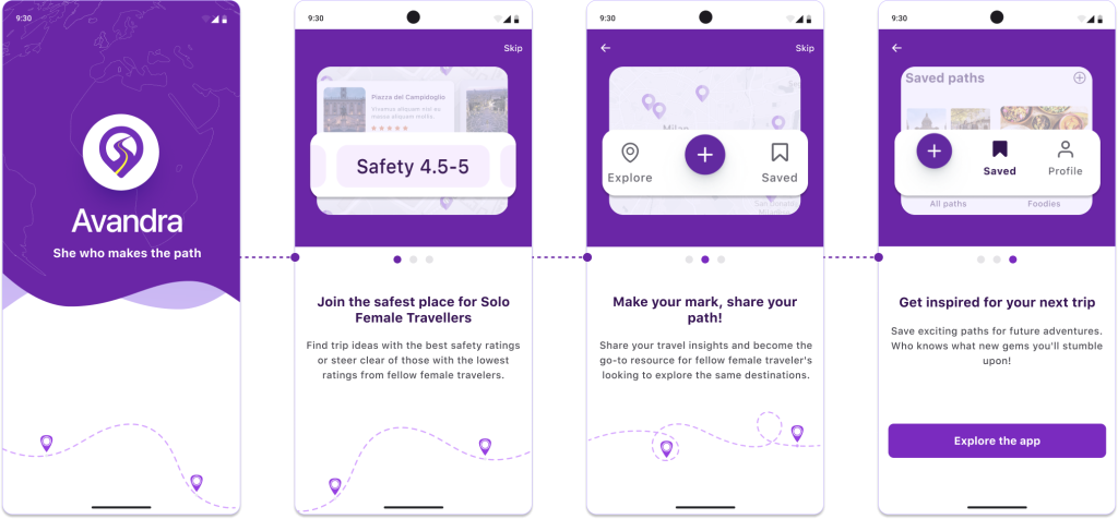
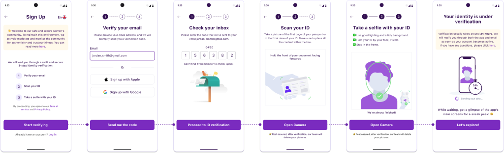
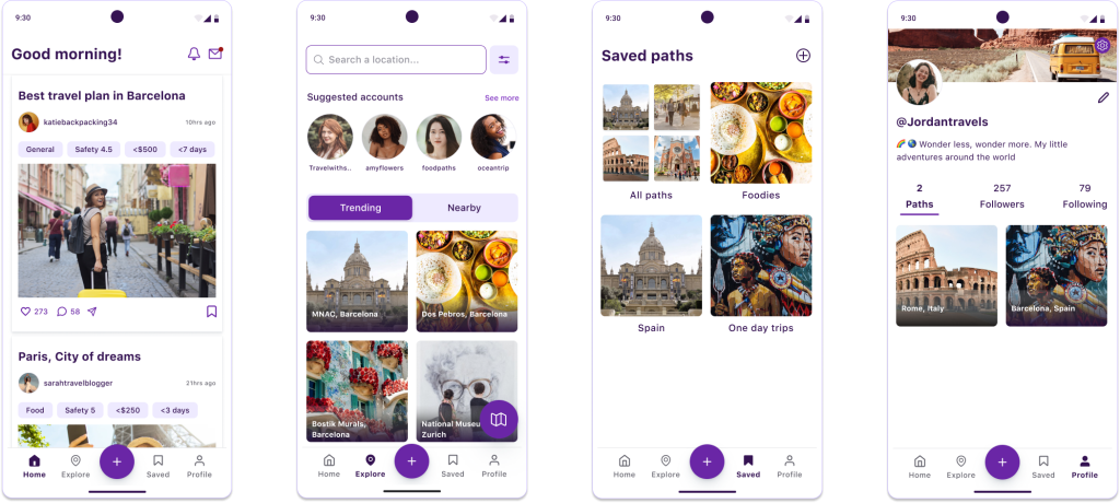
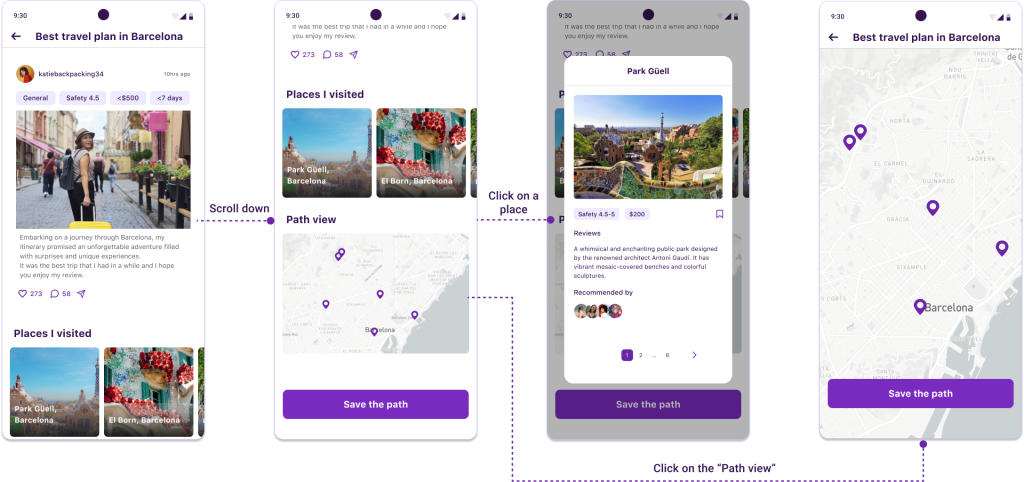
Challenge
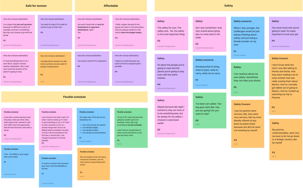
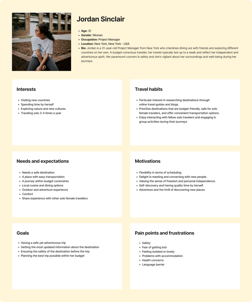
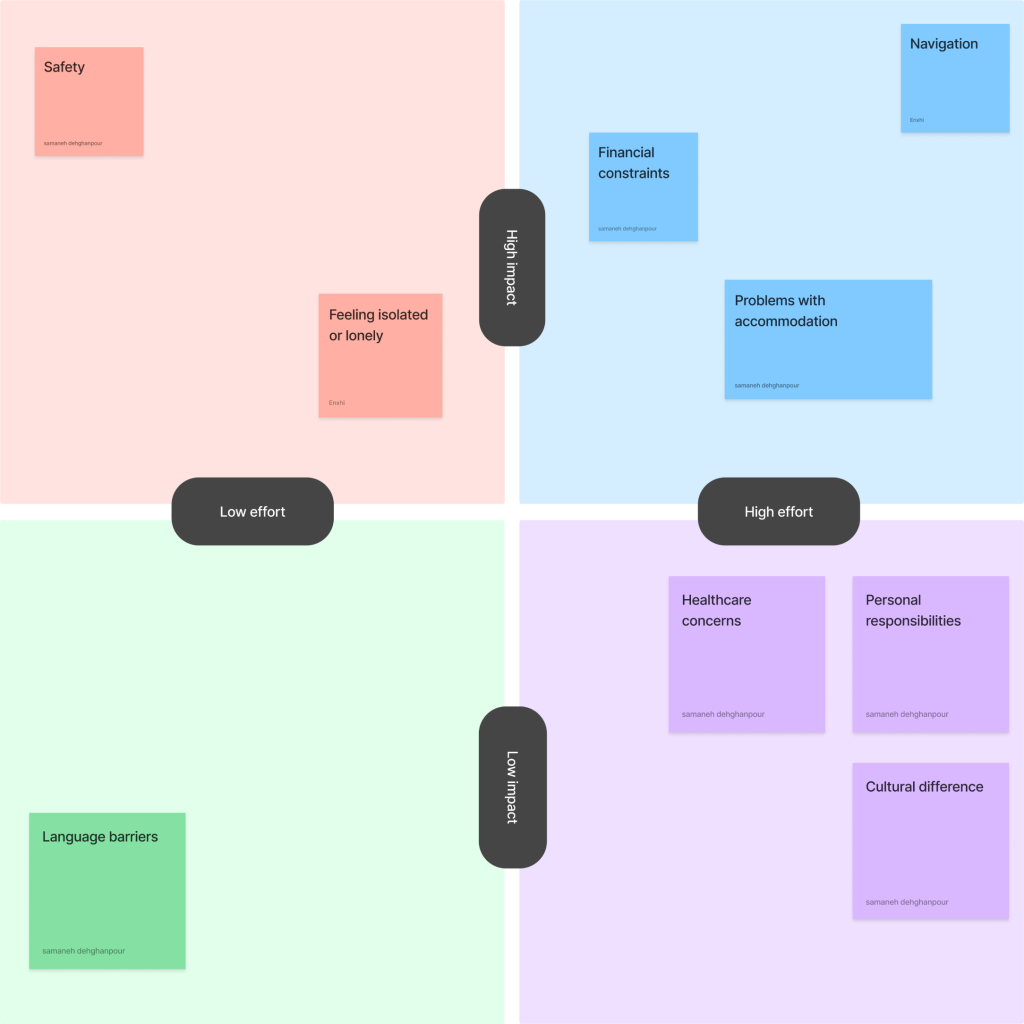
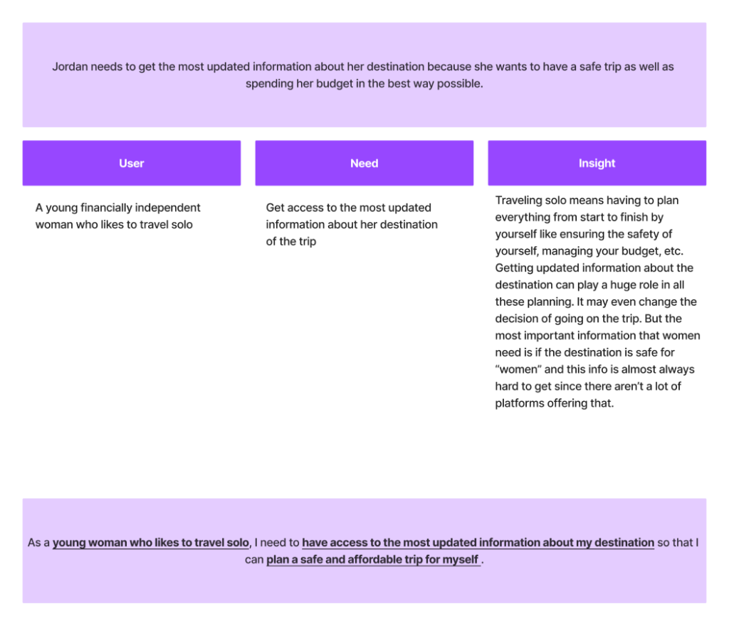
Design a platform for solo travelers to connect with each other, exchange information and find fellow travelers.
Role
UX designer in a team of 4 designers
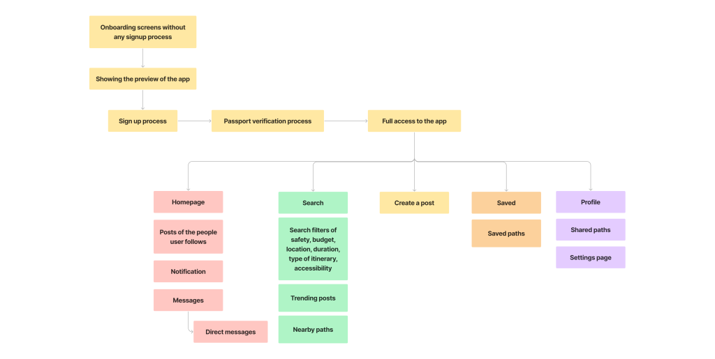
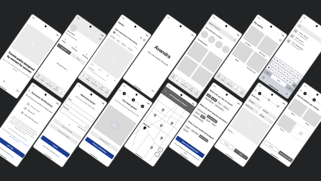
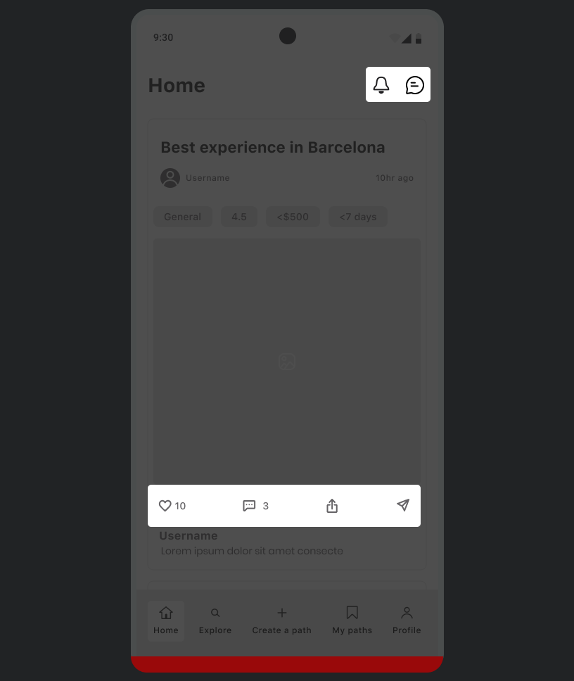
Deliverables
- User research report
- Task flows
- Sketches
- UI
- Prototype
Tools
- Figma
- Google suite
- Zoom
- Discord
- Notion
Timeline
August 17 – September 18, 2023